30
Mar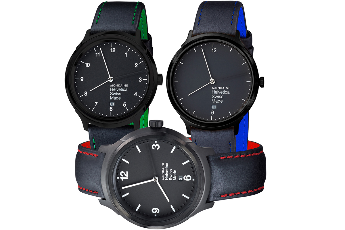
When we saw this watch a couple of days ago, we got very excited. It’s a beautifully engineered timepiece, which is enough to get some people excited. Their 2014 model featured the Helvetica font - a great collaboration that embodies the spirit of the classic font. This year, they have gone one step further and integrated the Pantone colours of the NYC Subway lines into the design.
Put simply, this watch combines a classic font with a carefully chosen range of Pantone colours that elevates a clean and simply executed design into something really special. This watch pretty much sums up how we think about your marketing materials.

